
Style guide
Ghost’s editor can emit nineteen kinds of card, and a card is rarely one thing: a callout has nine colours, a header card four backgrounds, a sign-up card three layouts. Below is each of them, with its variants, in the order a reader meets them. Each section says what the element is and what this theme does about it — because for some of them the right answer is deliberately nothing, and a style guide that hides that is not one.
Headings
Six levels, all reachable from the editor: type # through ###### in a markdown card, or pick H1–H6 from the contextual toolbar. The scale steps by a fixed ratio and inherits the display face down to h4, where it switches to the UI face one weight up — past that size a heading is a label, not a title.
An h1 inside the body is not the page title. page-styleguide.hbs sets the title separately from {{title}}, so an editor’s h1 is a heading in the article and gets the article’s own scale.
Heading level one
Heading level two
Heading level three
Heading level four
Heading level five
Heading level six
Links
Links in prose take the publication’s accent with a 1px underline offset by 3px, so descenders stay legible: an ordinary inline link, and one that points inside the publication. A pasted address becomes a link on its own — https://ghost.org/docs/ — which is why descriptive link text is worth writing by hand.
Text formatting
Everything the toolbar and the markdown renderer can do to a run of text inside a paragraph.
Emphasis
Text can be bold, italic, both at once, or struck through. Bold takes one weight up in the body face rather than the display face, which at reading size is the difference between emphasis and a heading in the wrong place.
Inline code
Backticks make inline code, which gets a tinted chip and the mono face at 0.92em — small enough not to open the line, large enough to read at reading distance. A whole line of it, --mirror-accent: #b45309, keeps the same measure.
Highlighting
Type ==text== in a markdown card, or use the editor’s highlight button, and Ghost emits a bare <mark>. Nothing styled it: the frontend loads this theme’s stylesheet and cards.min.css, and the one mark rule Ghost owns is in ghost.min.css, a file it never serves to a reader.
The fill is the publication’s accent, laid over the page at 22% — one percentage that reads the same in both Modes, where the browser’s default was #ff0 on #000.
Subscript and superscript
~sub~ and ^sup^ come from the same markdown renderer. The browser’s own default sizes them at 0.83em, which is large enough to open the line they sit in, so both are set smaller and lifted with vertical-align instead.
Water is H2O, and this is the 3rd of the month.
Lists
Both kinds keep the body measure, and their markers sit in the muted tone rather than the text tone: a marker is scaffolding, and at full contrast a long list reads as a column of dots.
Unordered
- Unordered lists keep the body measure
- Markers sit in the muted tone
- An item can run long enough to wrap, in which case the second line aligns with the first rather than with the marker
Ordered
- Ordered lists number in the same muted tone
- The number is the marker, not part of the text
- Nested items indent by one step and start their own count
Nested
- A list can hold a list
- The nested marker changes, which is the browser’s own behaviour and worth keeping
- Two levels is the most an article should need
- And then continue at the first level
Dividers
Three dashes in a markdown card, or the divider card, produce an <hr>. It draws as a hairline in the border tone at the width of the measure — not a full-bleed rule, because the divider belongs to the column it divides.
Quotes
Two shapes, and they mean different things. A blockquote is somebody else talking; a pull quote is the author raising their voice.
Blockquote
A theme is a promise about how much you respect the reader’s attention.
Blockquote · attribution
Pull quote
The editor’s second quote style. Ghost stores it as an aside node and renders <blockquote class="kg-blockquote-alt">, which the theme sets in the display face, centred, with no rail — the opposite treatment to the one above, so the two can never be mistaken for each other.
Pull quotes break the column and reset the reader’s pace.
Tables
Ghost emits a bare <table> — no wrapper, no class, nothing named kg-table anywhere in 6.60 — and a table stops shrinking at its min-content width, so a wide one used to push the whole page past the viewport. assets/js/main.js wraps each one in its own scroll container, so the columns stay reachable and the page keeps its measure.
Within the measure
| Tier | Price | Archive | Interviews |
|---|---|---|---|
| Free | $0 | Partial | No |
| Member | $7 | Full | Yes |
| Patron | $18 | Full | Yes |
Wider than the measure
Ten columns, on purpose. The shell scrolls; the page does not.
| # | Tier | Price | Archive | Interviews | Field notes | Comments | Newsletter | Events | Backfile |
|---|---|---|---|---|---|---|---|---|---|
| 1 | Free | $0 | Partial | No | No | Read | Weekly | No | No |
| 2 | Member | $7 | Full | Yes | Yes | Write | Weekly | Yes | Partial |
| 3 | Patron | $18 | Full | Yes | Yes | Write | Weekly | Yes | Full |
Code blocks
The code card takes an optional language and an optional caption, and Ghost emits a different element for each combination: with a caption it wraps the block in figure.kg-code-card, and without one it returns the bare <pre>. The theme wraps either in its own scroll shell and draws the language as a strip above the block, read from the language-* class rather than typed twice.
With a language
@theme {
  --color-bg: var(--mirror-bg);
  --color-surface: var(--mirror-surface);
  --color-accent: var(--mirror-accent);
}
Without a language
No strip, because there is nothing true to put in it.
$ ghost start
✔ Starting Ghost
→ http://localhost:2368
With a caption
export const measure = (text) => text.length / 68;figure.Buttons
The button card has one style on the frontend — kg-btn kg-btn-accent, filled with the publication’s accent — and two alignments. Its ink is Ghost’s #fff and stays Ghost’s: the accent is the buyer’s, and claiming the ink without the fill is what puts white text on a pale panel.
Left aligned
Centred
Callouts
The design draws one callout: an accent rail instead of Ghost’s filled block. Ghost offers nine colours, and all nine of its tints are translucent — #21ace81f is blue at 12% — so they sit over the page in either Mode without a rule from the theme. What the theme adds is the rail, and the rail takes the author’s own colour: a blue panel with an amber rail is the theme arguing with the person who chose blue.
Without an emoji
The emoji is optional in the editor, and when it is off Ghost omits the element rather than leaving it empty — so the text takes the whole card and the rail still says what kind of note it is.
calloutEmoji is false, and callout-renderer.js never appends the div.Toggles
A disclosure with a heading and a body. The card ships closed — data-kg-toggle-state="close" — and Ghost’s own cards.min.js is what opens it, so the theme claims the panel, the radius and the heading’s face and leaves the chevron and its animation alone. Owning half of a disclosure it does not drive is how a theme ends up with a card that animates the wrong way.
Does the theme support memberships?
Bookmarks
A bookmark card is a scraped link: title, description, publisher, author, favicon and thumbnail, each of them present only if the scrape found it. The design draws this card, so it takes the design’s colour in both Modes — the page surface, a hairline, and the muted step for the metadata row.
With a thumbnail

Without a thumbnail
Most links have no usable image, and Ghost omits the element entirely rather than leaving a grey box — so the content simply takes the full width.

With a caption
A caption turns the card into a captioned figure, which is where kg-card-hascaption comes from.
Images
Three widths, a caption, an optional link, and an alt text. The theme sets max-width: 100% rather than width: 100%: an editor can upload an image narrower than the measure, and stretching it to the column is the one thing a theme must not do to somebody’s photograph.
Regular
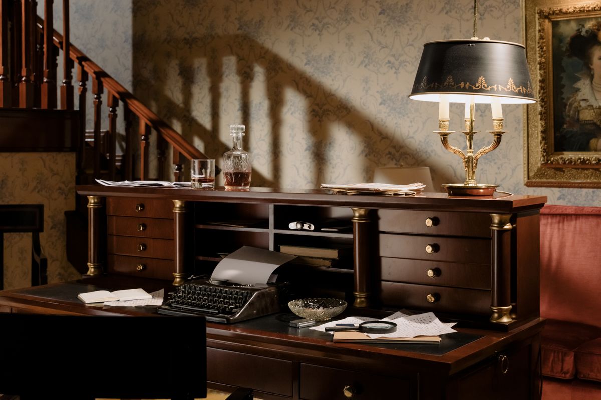
Wide

Full width
Ghost offers a third step that runs to the edge of the viewport. The design has no viewport-edge treatment at all, so the theme renders full at the wide step rather than inventing one.
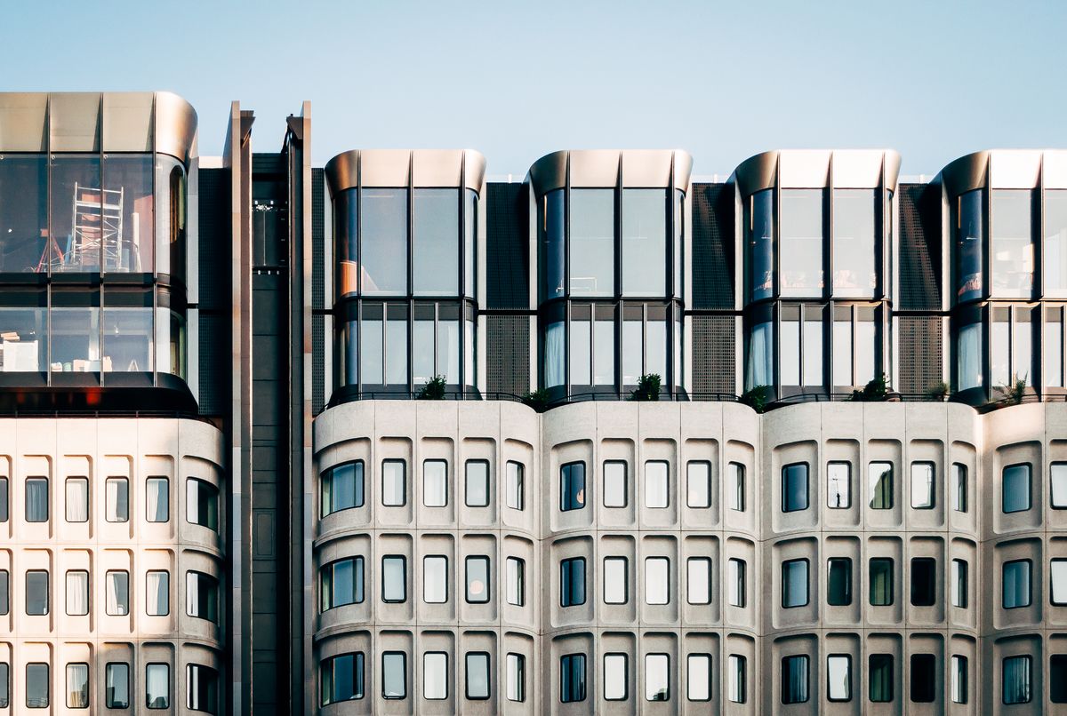
Without a caption
No figcaption, and no kg-card-hascaption — which matters, because Ghost uses that class’s absence to close two adjacent uncaptioned images up into a series.
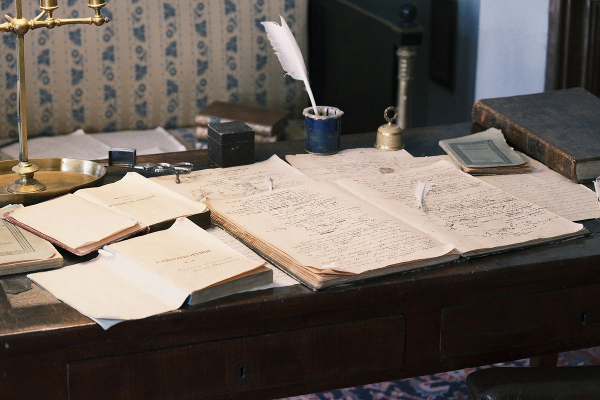
Linked
An image can carry a link, in which case Ghost wraps the img in an a inside the figure. The theme’s image rule matches .kg-image as well as figure > img for exactly this reason: an image nested one level deeper must not lose its radius.

Galleries
A gallery packs up to three images per row and is always wide — gallery-renderer.js hardcodes kg-width-wide, so there is no regular gallery to specimen. Ghost also rebalances the last row: four images become two and two rather than three and one.
Two per row

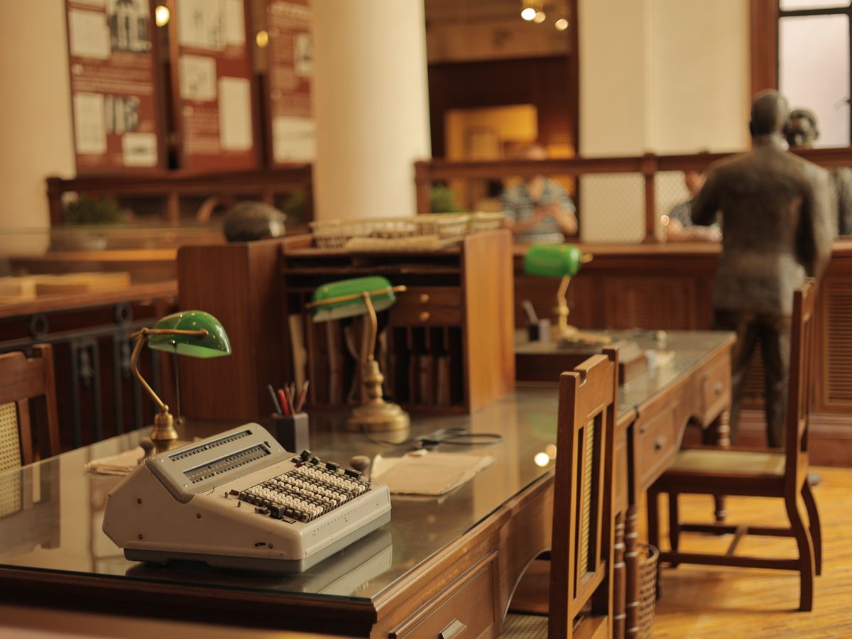
Three per row, with a caption

Audio
Ghost’s own player: thumbnail, title, seek, rate and volume. The design draws no player, so the theme claims nothing but the colour — Ghost hardcodes a white panel with #222 ink, which in dark Mode was a white slab in the middle of a near-black page.
With a thumbnail
Without a thumbnail
Both thumbnail elements are always emitted and one of them carries kg-audio-hide. The placeholder fills with the publication’s accent and a white file icon — Ghost’s own pairing, left alone here for the same reason the button card’s ink is.
Video
The same shape with its controls over the frame, and the one card where nothing is claimed at all: every white value in Ghost’s CSS sits inside a bar painted over #00000080 on top of the video, so it is already right in both Modes. Video takes the three widths images do, and its control set is complete for the same reason the audio one is.
Files
A download: title, caption, filename, size and a circled arrow. Colour only again — the panel and its ink, not the geometry. Ghost’s CSS still carries kg-file-card-small and -medium, but file-renderer.js emits neither, so there is one shape to specimen and the size variants are dead classes.
Products
A product card is a title, a description, an optional image, an optional five-star rating and an optional accent button. The design draws it, so it takes the design’s colour. The rating needs no rule of its own: Ghost draws all five stars with fill: currentColor at 15% and the filled ones at 100%, so claiming the container’s color carries them both.
Plain
MIRROR — Ghost theme
Two directions, dark mode, full card coverage, AA contrast throughout.
With a rating and an image
The Quarry Reader — hardback
Four of five stars: the fifth is drawn at 15% of the same ink rather than omitted.
Header cards
A full-width band with a heading, a subheading and a button. This is the one card where a Mode has no say and the theme claims nothing: header-renderer.js writes the background and every ink INLINE, out of the author’s own editor fields, so the colours below are choices made in Ghost admin and not values a stylesheet could own. The v2 card takes four widths — regular, wide, full and split — and no size class; kg-size-small and -large belong to v1.
Colour background
Accent background
Choosing "accent" swaps the inline colour for kg-style-accent, which is the one header background that follows the publication rather than the author.
Filed under the accent
The only header background a buyer changes by changing their brand colour.
Image background
An image background is a picture element absolutely positioned behind the text, which is why the ink is always set inline: the author is reading their own photograph, not a token.
Split layout
The split layout puts the image beside the text instead of behind it, and is always full width — getCardClasses pushes kg-layout-split kg-width-full together, so there is no narrow split to specimen.
Beside, not behind
Add kg-swapped and the image moves to the other side.
Sign-up cards
Portal’s form inside the article. Its field row needed both halves of the claim: Ghost sets the input’s background to #fff and leaves the text to inherit, so in dark Mode a visitor typed near-white on white. Ghost also renders this card with display: none and data-lexical-signup-form, and reveals it from its own script — which is why every specimen below is stated with that inline style removed.
Regular width
One considered essay, every Thursday
Free members get the archive. Paid members get the interviews.
No spam. Unsubscribe anytime.
Accent background, full width
Read the whole quarry
The accent variant is the publication’s colour, so it changes when the buyer’s does.
The error state
Portal puts error on the form and writes the reason into kg-signup-card-error. Ghost’s own colour for that text is #ff0000; the theme replaces the field row’s border with its danger token so the failure reads as one thing rather than a red sentence under a normal-looking input.
Calls to action
The newest card here, and newer than the design. Ghost’s own colours are translucent greys over the page, so they survive both Modes untouched; nine background tints, two layouts, an optional image, an optional sponsor label and an optional pair of dividers.
Its button is the one accent control Ghost gives no ink at all: the CSS sets a background and calltoaction-renderer.js writes color inline instead. The first of the three below carries that inline value the way the editor writes it; the other two are pasted markup without it, which used to render an accent label on an accent button and now falls back to the same white Ghost uses on every other accent control.
Minimal
The interviews are for members. The archive is for everyone.Become a member
Immersive
The immersive layout fills the panel and centres its contents; the minimal one keeps the text and the button on one line where there is room.
Six years of interviews, indexed and searchable.
With a sponsor label and an image
Sponsored by Verso Press
A sponsor label sits above the panel and takes its own dividers.
Embeds
Embeds are the only card type Ghost ships no CSS for — cards.manifest.json has sixteen bundles and embed is not one of them — so the frame renders at whatever size the oEmbed provider returned. This theme sizes it to the measure and gives a video player a 16:9 ratio, matched on allowfullscreen so a social embed is not cropped into a video’s shape.
YouTube
width="200" in its own oEmbed html; the frame above is 100% wide at 16:9 because the theme says so.X
A theme is a promise about how much you respect the reader’s attention.
— The Quarry (@thequarry) March 25, 2024
NFT
There is no NFT node in the Lexical editor, so a new post cannot contain one. @tryghost/kg-default-cards still renders it though, which is the path every mobiledoc post takes — a publication migrating onto this theme can arrive with years of them. Its three inks are #222 and #ababab on a container with no background at all, so in dark Mode it was near-black text on a near-black page.

Footnotes
Footnotes come only from a markdown card — Lexical has no footnote card — and produce five classes Ghost styles none of: the reference, the separator, the section, the list and the way back.
A markdown card produces these: a reference,[1] a separator, and a section at the foot of the page.[2]
What this page cannot show
Four card types are missing on purpose, and each for a reason that is worth more than a specimen would be.
- The collection card renders posts the platform picks at render time. A hand-written copy would specimen markup Ghost never emits, which is the opposite of what this page is for.
- The transistor card is an iframe pointing at a podcast host. Its placeholder already draws with
color-mix(in srgb, currentColor …), so it needs nothing from the theme, and a real embed would put a third-party request into every screenshot. - The paywall card emits an HTML comment and nothing else — Ghost’s output serializer splits the post there before any template runs. Its visible half is the Gate, which is a state of a Post and belongs on a post rather than here.
- The email and email CTA cards render only into a newsletter, and are deliberately dropped from the web version by the renderer itself.